Recent posts

Money Talks
The Intricacies of Trading Crypto vs. Forex
03 April 2024

Industry Experts
5 Effective Ways to Drive Traffic to Your Website
19 March 2024

Fur, Fins & Feathers
How To Maintain Your Dog’s Oral Hygiene At Home
14 March 2024
nichemarket Advice
Demystifying TikTok Metrics for Brands (Especially Small Businesses)
13 March 2024
Popular posts
Extravaganza
Trending Music Hashtags To Get Your Posts Noticed
24 August 2018
Geek Chic
How To Fix iPhone/iPad Only Charging In Certain Positions
05 July 2020
Extravaganza
Trending Wedding Hashtags To Get Your Posts Noticed
18 September 2018
Money Talks
How To Find Coupons & Vouchers Online In South Africa
28 March 2019
Brands Changing with Time: Logo Evolution
19 November 2016 | 0 comments | Posted by Shamima Ahmed in nichemarket Advice

The importance of logos is often overlooked in the world of small businesses. Generally, logos are designed once and used throughout the business lifetime. Working with many small businesses we notice that sometimes these company logos today don't fit the current design best practices or limits visual application for different devices. This trend is more and more evident with brands making their day view into the digital spectrum. The thing with logos is they need to
Branding logo Comparison: Birth vs Present Day
Google:
Between Google, Facebook and Apple we see the most changes in company logos from launch to ![]()
The logo has since then changed 6 times and in September 2015, they released the newest version of the logo seen below: ![]()
Facebook:
Starting off with The Facebook in 2005, the logo of the most popular social media platform today leaves a lot to be desired. 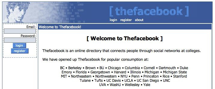
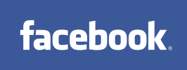
In July 2015, the present day facebook logo was released. Though the colour scheme is similar the design was much more thought through. The first logo looks like something a developer just
Twitter:
![]()
Twitter started off big and puffy with its launch in 2006 and evolved to a more simple iconic design in 2012.
![]()
The bluebird is synonymous with the brand and is recognised as the face of Twitter across the globe. This form of logo works great on all device types - an important factor to consider in a mobile-first world. andnbsp;
YouTube:
![]()
The YouTube logo featured on the left sports the original logo and slogan released in 2005 with the launch of the platform. Not much has changed with the present day logo, seen below, and released in 2011. The slogan has been dropped though and the design is sleeker and flatter to accommodate mobile devices. 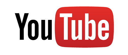
MSN and Bing:

MSN search engine had a few changes with regards to their branding. The first logo launched in 2006. In 2013 the brand revamped and not only changed their logo but brand name as well. MSN became Bing (logo right) and is now Google's main competitor (despite always being the bridesmaid).
![]()
Microsoft:
![]()
In 1975 the first Microsoft logo was born, seen on the left. Retro inspired and was used up until 1980. and; Below we have Microsoft's present-day logo which was introduced in 2012.
Very clean modern and neat. ![]()
Apple Inc.:
![]()
Apple's first logo was launched with their first prototype in April 1979, seen on the left. Below is Apple's present Day logo, a more modern design used since 1998: ![]()
Apple went through a similar transition as Twitter, adopting the less is more approach and opting for a more iconic logo.
Power of a logo
Do not underestimate the power and impact a great logo design can have to influence the awareness of your brand. As your business evolves, so does your brand. If you have been running for a while and your logo is outdated, set some budget aside to get it redone. If you staring off, add logo redesign to your to-do list.
Contact us
If you have any questions around logo design, feel free to comment below or contact us here.
You might also like

5 Helpful Travel Planning Tips for Complete Peace of Mind
22 February 2024
Posted by Brigitte Evans in Hit the Road
A look at some of the pre-travel planning you need to consider before you leave for the airport in order to ensure your mentally prepared for what co...
Read more
Why Am I Seeing Strange Referral Traffic In GA4?
02 March 2024
Posted by Che Kohler in nichemarket Advice
A look at the recent fake traffic spike many GA4 profiles are seeing at the moment, what are the causes, what you can do about it and how to report o...
Read more{{comment.sUserName}}
{{comment.iDayLastEdit}} day ago
{{comment.iDayLastEdit}} days ago