Recent posts

Geek Chic
What Is The Difference VDS vs VPS?
10 July 2026

Doctors Orders
Why EHR Software Is So Important for Modern Doctors
09 July 2026

Talent Agents
In-House Vs Outsourcing: What's the Right Fit for Your Business?
08 July 2026

nichemarket Advice
Why Finding Link-Building Opportunities in New Zealand Is So Hard
07 July 2026
Popular posts
Extravaganza
Trending Music Hashtags To Get Your Posts Noticed
24 August 2018
Geek Chic
How To Fix iPhone/iPad Only Charging In Certain Positions
05 July 2020
Extravaganza
Trending Wedding Hashtags To Get Your Posts Noticed
18 September 2018
Money Talks
How To Find Coupons & Vouchers Online In South Africa
28 March 2019
Getting Started with Data Visualization in Google Sheets
13 September 2018 | 0 comments | Posted by Shiraaz Moollatjie in Industry Experts
The greatest value of a picture is when it forces us to notice what we never expected to see - John W. Turkey
Data visualisation is sometimes seen as a complex task. In actual fact, it is straightforward to get started, and this post will describe how to do this using Google Sheets.
Retrieving data and visualising data are not the same things
Sometimes data visualisation is seen as complex because we tend to combine the technique of fetching data with the method of displaying data. In actual fact, these are entirely different techniques, and data retrieval does not need to be visualised.
When you split the two methods, you find that visualisation is relatively simple to implement because of all the technologies that are available. One of these tools is Google Sheets. The advantage of Google Sheets is that it gives you many visualisations out of the box.
Starting with some sample data
So let’s begin with some simple data. For our dataset, we use the progression of 100m world records in athletics. Now we look at the kind of data that we’re dealing with.
100m records are typically times against a certain date and maybe the athlete associated with the time. For us, the goal is to display the progression, so either a line chart or a timeline is suited for this. Since we also want to display the changes in progression, a line chart is more suited to this goal.
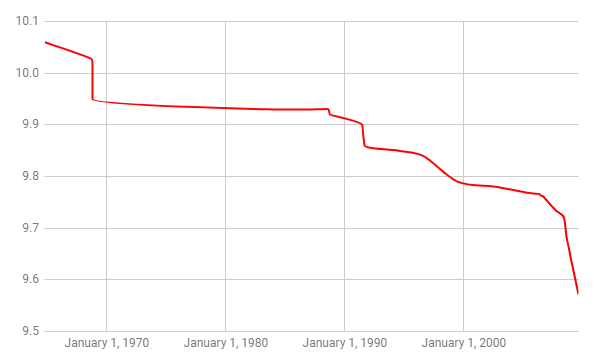
So we take a shot at a line chart, and we get this image:
Visualizing - Color and data points
So I started with a red line chart. A few things stand out:
- Red is typically a negative colour; progression is a positive data sentiment. So we need to change this accordingly
- What’s important on the line chart is the data points, not the line that it makes. The reason is that world records are broken at that point in time. It’s not to say that athletes are improving at that level.
So we make the following changes:
- Line chart colour to blue
- Display the data points
- Slant the dates on the horizontal axis to 60 degrees
Then we have this as our final image:
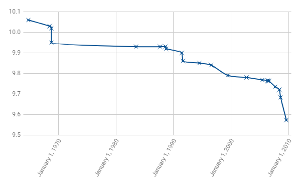
This is better because it achieves our goal better. We’re able to see the progression of 100m world records over time, and their rate of change is displayed as well.
Conclusion
As you can see, data visualisation can be easy to accomplish using any tool. We took a simple dataset, did a quick chart and improved the chart until it conveyed our goal properly. Whether you’re using Python to do this or whether you’re using Google Sheets, you’re still implementing the same thought process. If you found this interesting and you would like to go further in-depth, take a look at the data visualisation catalogue.
Shiraaz Moollatjie
Technical Architect
More About Shiraaz on LinkedIn
About the author
Contact us
If you feel inspired and want to contribute with a guest post, then don’t be shy we’re happy to assist. Simply contact us here.
Tags: Data Analysis, Data Visualization, Google sheets, guest post
You might also like

How Corporate Gifting Can Improve Customer Retention
03 July 2026
Posted by Shamima Ahmed in nichemarket Advice
Corporate gifting is one of the most underused retention tools in marketing. Here's how to use it strategically and what gifts actually work.
Read moreWhy Finding Link-Building Opportunities in New Zealand Is So Hard
07 July 2026
Posted by Che Kohler in nichemarket Advice
We look at the local conditions SEOS and link builders face in New Zealand, and why it can be so hard to secure backlinks for your brand or business ...
Read more{{comment.sUserName}}
{{comment.iDayLastEdit}} day ago
{{comment.iDayLastEdit}} days ago