Recent posts
Money Talks
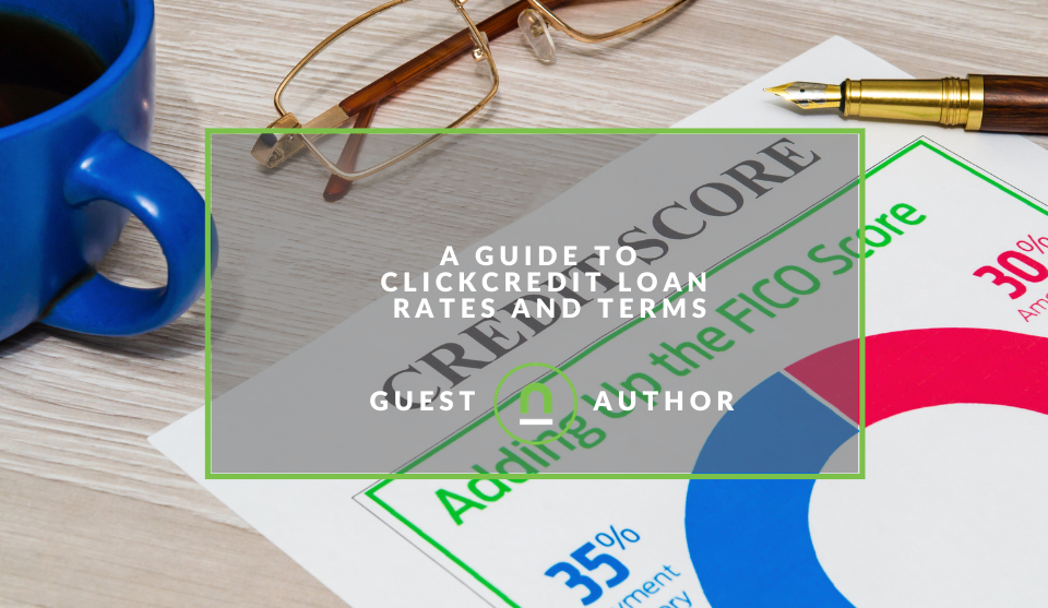
A Guide To ClickCredit Loan Rates and Terms
05 June 2026
Ace of Trades
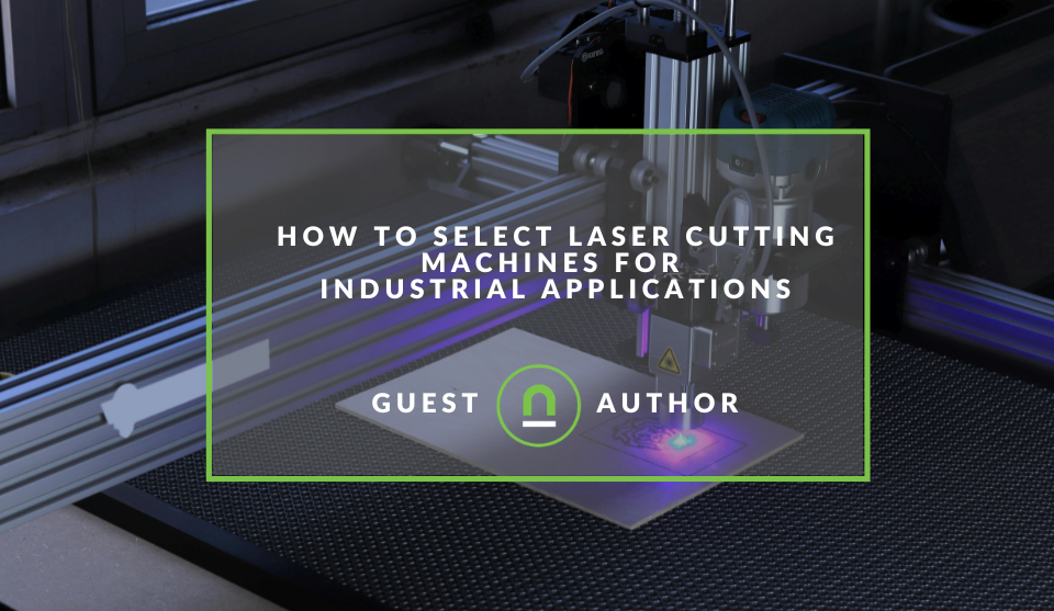
How To Select Laser Cutting Machines for Industrial Applications
29 May 2026
Fur, Fins & Feathers
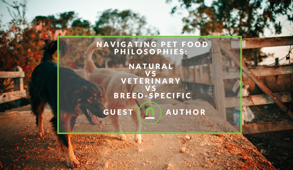
Navigating Pet Food Philosophies: Natural vs Veterinary vs Breed-Specific
26 May 2026
Money Talks
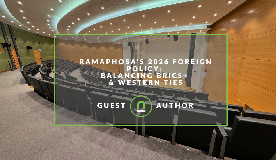
Ramaphosa’s 2026 Foreign Policy: Balancing BRICS+ & Western Ties
22 May 2026
Popular posts
Extravaganza
Trending Music Hashtags To Get Your Posts Noticed
24 August 2018
Geek Chic
How To Fix iPhone/iPad Only Charging In Certain Positions
05 July 2020
Extravaganza
Trending Wedding Hashtags To Get Your Posts Noticed
18 September 2018
Money Talks
How To Find Coupons & Vouchers Online In South Africa
28 March 2019
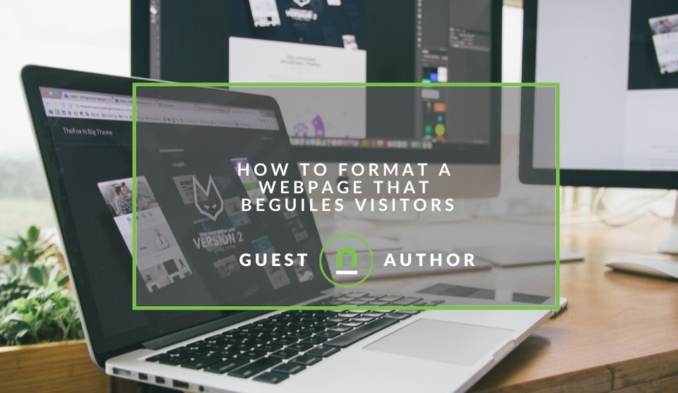
How To Format A Webpage That Beguiles Visitors
15 July 2020 | 0 comments | Posted by Lidia van Wyk in Industry Experts
A study performed by Enquiro analysed eye tracking movements of fifty users on the Google SERPs (search result engine pages). The shape of the movement revealed a “golden triangle” – showing how nothing beats organic search results. So how exactly did Google track the eye movements of users? Well, people often follow their eyes with their mouse when using a computer and approximate eye movements are then easily captured with a few lines of JavaScript.
As part of my digital psychology course through CXL Institute, I’m going to share some interesting insights about how users view and analyse websites. When initially landing on your site, a user’s eye path starts from the upper left corner and moves on from there.
The value proposition of your site should be visible in the top left zone. The bottom left of a page is usually the weak fallow area which doesn’t form an important area for placing pertinent information. As most people scan and not view websites, users tend to read website content in an F shape.
They generally start at the top left of the page after which they scan the top of the site for the navigation or log in details. After this they move down, reading the next full row of content – all the way to the sidebar. Images generally tend to receive the highest level of attention, then headlines and after that text.
Some tips for captivating the attention of your users:
1. Bigger introductory paragraphs for improved attention
Make these in boldface or larger font size. It’s good to keep the paragraph line lengths short and in a single column. Font type is not that important, but users like to click on links.
2. People generally don’t look past the first page of search results
An interesting study by Google discovered that once users found what they were looking for, they didn’t have a need to go further down the page. Using long-tail keyword strategies are generally more important.
3. The left side of the page generally gets more attention than the right
People generally read from left to right. This is why the left side of your page is more important. 69% of web users spend their time viewing the left side of the page and only 30% viewing the right side. If you opt for a vertical menu, always place this on the left. A navigation menu is usually always placed at the top of the page and is studied for the longest duration.
4. Use high quality, large images
The quality of your image will play a significant role in attracting a user’s attention, particularly if the subject in the picture is facing forward. This creates a more welcoming and approachable feeling. Try to stay away from fuzzy, small images or airbrushed pictures that don’t portray a real person who appears natural. Another tip to take into account is being selective when choosing a generic stock image. Ensure that the images you choose give the visitor a sense of texture, size, scale, detail, context and brand. These can affect a person’s mood, even when they are unaware that it’s happening.
5. Powerful headlines attract attention
Impactful dominant headlines draw the eye first when a visitor lands on your site. This is especially true whey they are in the upper left corner.
6. Clarity trumps persuasion
The simple and yet powerful way to drive customers deeper into your web page is by being clear. Don’t stress about having the perfect persuasion words in the ideal order when creating your website copy. Instead, focus on answering these three pertinent questions.
Where am I?
Even though this question is super simple, there are so many websites that don’t answer this. It’s important to think like your visitor and remember that your physical storefront needs to be emulated online and create a moment of orientation immediately.
What can I do here?
In the next few seconds after a visitor lands on your site, they should know what they can do to begin a dialogue with you and move forward. This cannot be confusing. Customers will navigate your site, and the cognitive process will gain forward momentum as to what they should do and why they should do it. The more time they spend on your site, the higher the probability of conversion grows.
Why should I do it?
This is probably the most challenging question to answer and needs to be answered in the context of all the other competitive options available to your prospective customers. This is your value proposition. Why should I buy this product from you rather than any of your competitors? Stay away from vague statements of quality rather than specific statements of quantity.
7. Readers ignore banners
Banners have a poor conversion rate. Modern digital marketing took them a bit too far at one stage, and we’ve been habitually ingrained to ignore them.
8. Visitors spend more time looking at menus and buttons than other parts of your website
Menus and buttons are what usually leads us to find solutions to our problems. Visitors to a site pay extra attention to these as they want to see what the options are. As a site owner, you should do the same and put extra effort into paying attention to your menus and how you label your call-to-action – CTA’s.
9. Lists are better at keeping your readers focused in comparison to large paragraphs
No one wants to read a huge chunk of text, especially if they already know about a particular topic. Some people even completely ignore large portions of text. It’s good to create a fair amount of white text on your site, so there is balance.
Putting it all together
In summary, keep your content short and simple. When reading long paragraphs, users need concentration which is something mobile users lack. Mobile users absorb visuals more than text or content. Users pay the most attention to the top of the screen, and lastly, short, hard-hitting headlines draw more attention. Make your headlines stand out.
About the author
I'm a prolific writer and paid media specialist with over 15 years of writing experience. I immerse myself in my client's brand by asking pertinent questions at the start of any creative process in order to deliver copy or campaigns that are on point. I also run a digital brand called Colab-Digital and assist clients with digital marketing efforts in order to help them win more customers and be relevant with their offer to market.
Tell us your story
Would you like to write for nichemarket just like Lidia has? Find out how to submit a guest post and when you're ready, you can contact us.
Are you looking to promote your business?
South African businesses can create your free business listing on nichemarket. The more information you provide about your business, the easier it will be for your customers to find you online.
Registering with nichemarket is easy; all you will need to do is head over to our sign up form and follow the instructions. If you require a more detailed guide on how to create your profile or your listing, then we highly recommend you check out the following articles.
Recommended reading
If you enjoyed this post and have time to spare why not check out these related posts and dive deeper down the rabbit hole that is conversion rate optimisation.
- How To Optimise Your Contact Us Page
- 7 Signs Your Website Needs A Redesign
- Improve Your Conversion Rate & User Engagement With reCAPTCHA V3
- 10 Ways To Improve Your Conversion Rate
- 7 Copywriting Tips To Boost Your Conversion Rates
Tags: UX, UI , User Experience , Guest Post
You might also like
A Guide To ClickCredit Loan Rates and Terms
05 June 2026
Posted by Anna Kapinus in Money Talks
ClickCredit offers short-term online cash loans in South Africa ranging from R500 to R8,000. Loan terms are strictly short-term, spanning from 5 to 4...
Read moreHow To Select Laser Cutting Machines for Industrial Applications
29 May 2026
Posted by Edward Fourie in Ace of Trades
A breakdown of laser cutting machines and what businesses and decision makers need to look for when choosing industrial laser cutting machines
Read more{{comment.sUserName}}
{{comment.iDayLastEdit}} day ago
{{comment.iDayLastEdit}} days ago